︎
Heena Chung
Lead Designer at
NIKE
. Previously at
NIKE VIRTUAL STUDIOS
(Remote),
Something Special Studios*
(NYC),
Porto Rocha
(NYC),
thisisneverthat®
(Seoul).
Contact information for freelance and collaboration inquiries:
Email
,
Instagram
,
LinkedIn
View Thumbnails:
Small
,
Medium
,
Large
YU-GI-OH! x DOTSWOOSH
The North Face Climb Festival
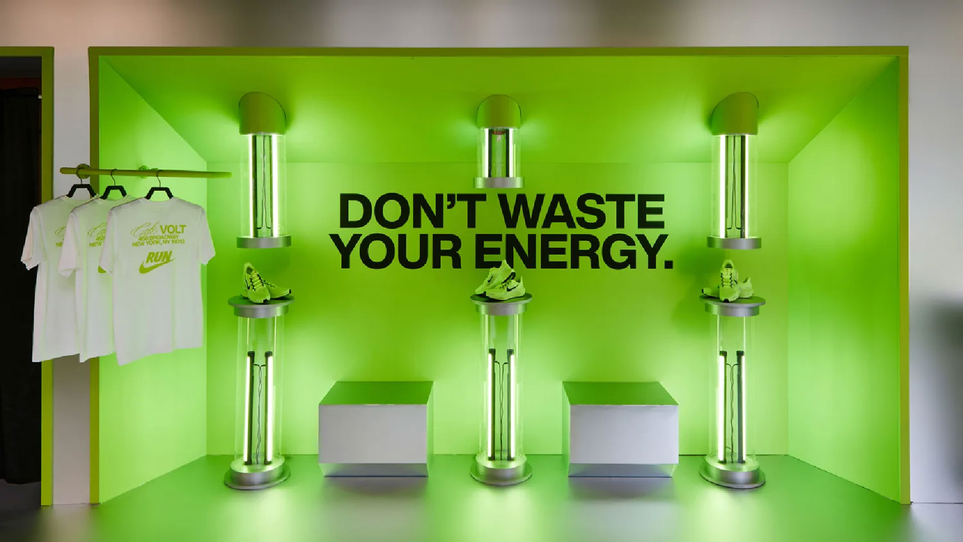
Nike Running Café Volt
SNKRS: Max Access
Mailchimp
Nike Sole Perspectives
VANS Brand book
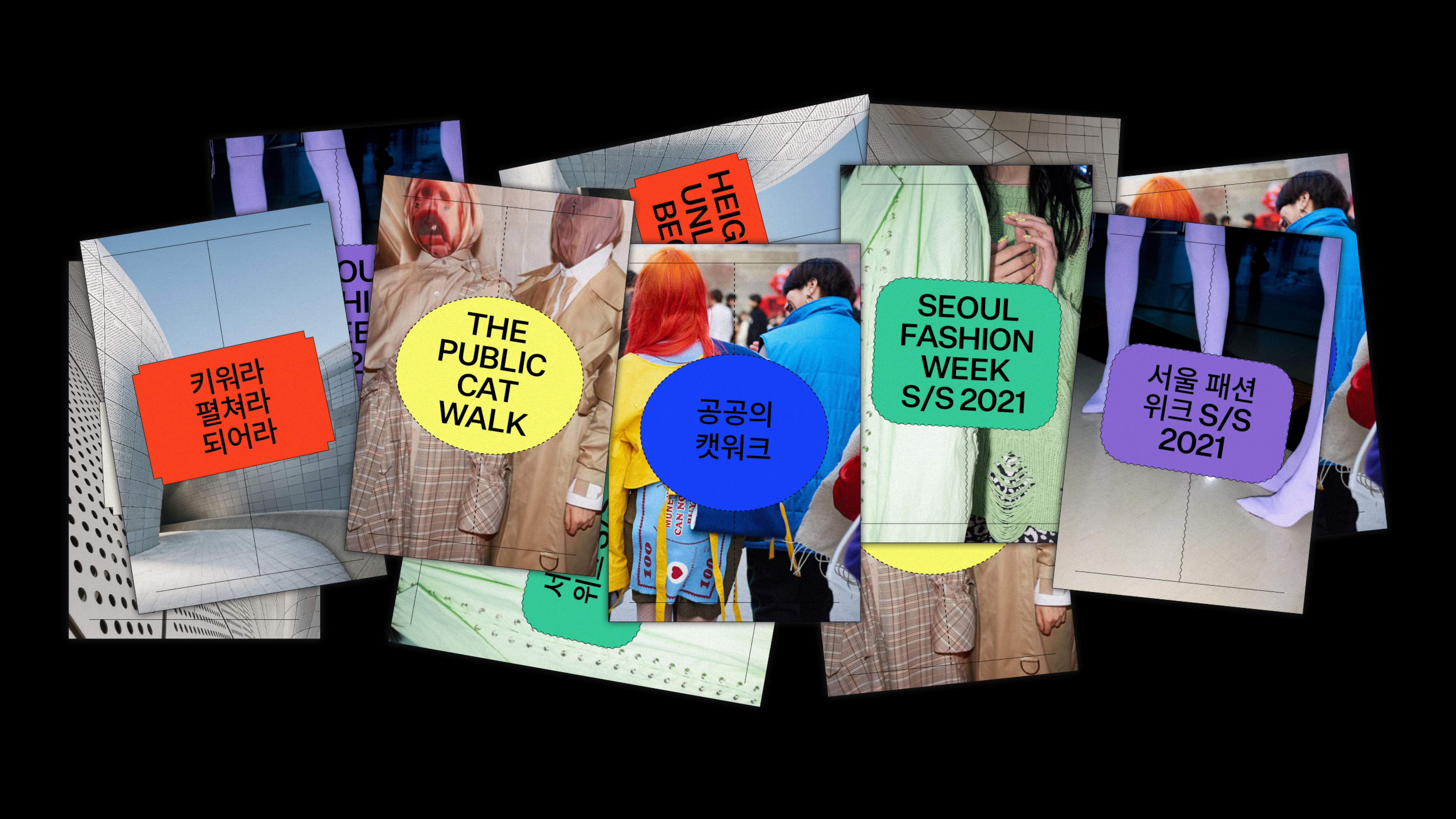
Zigzag
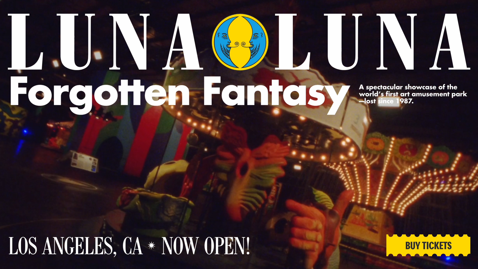
Luna Luna 1.0
Nike Well Collective Exchange
Available Works
Luna Luna 2.0
Converse x thisisneverthat®
thisisneverthat® FA21
Eaton Workshop
Spin Projects: SP Wire
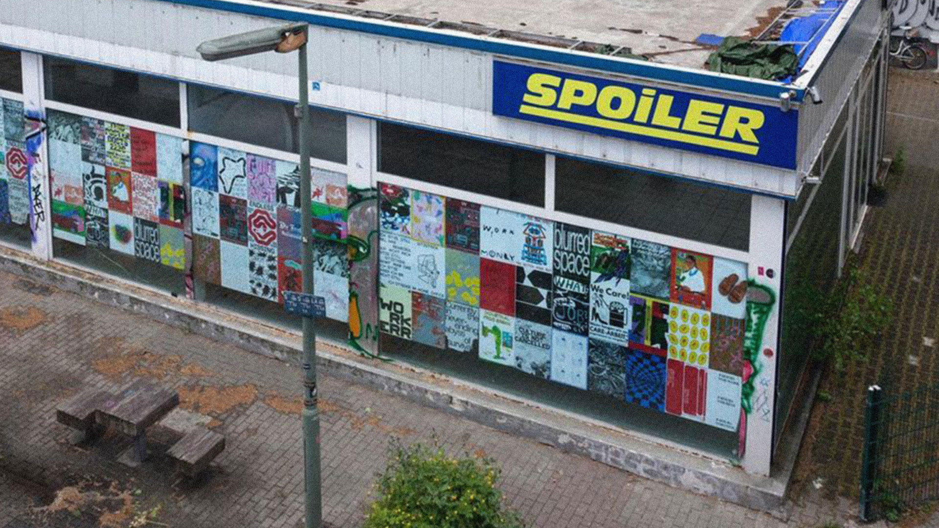
Spoilerzone
SSS* Misc
Brain Magazine
(TITLE) NON-PLACE
NONPLACEPLACE
The Hub
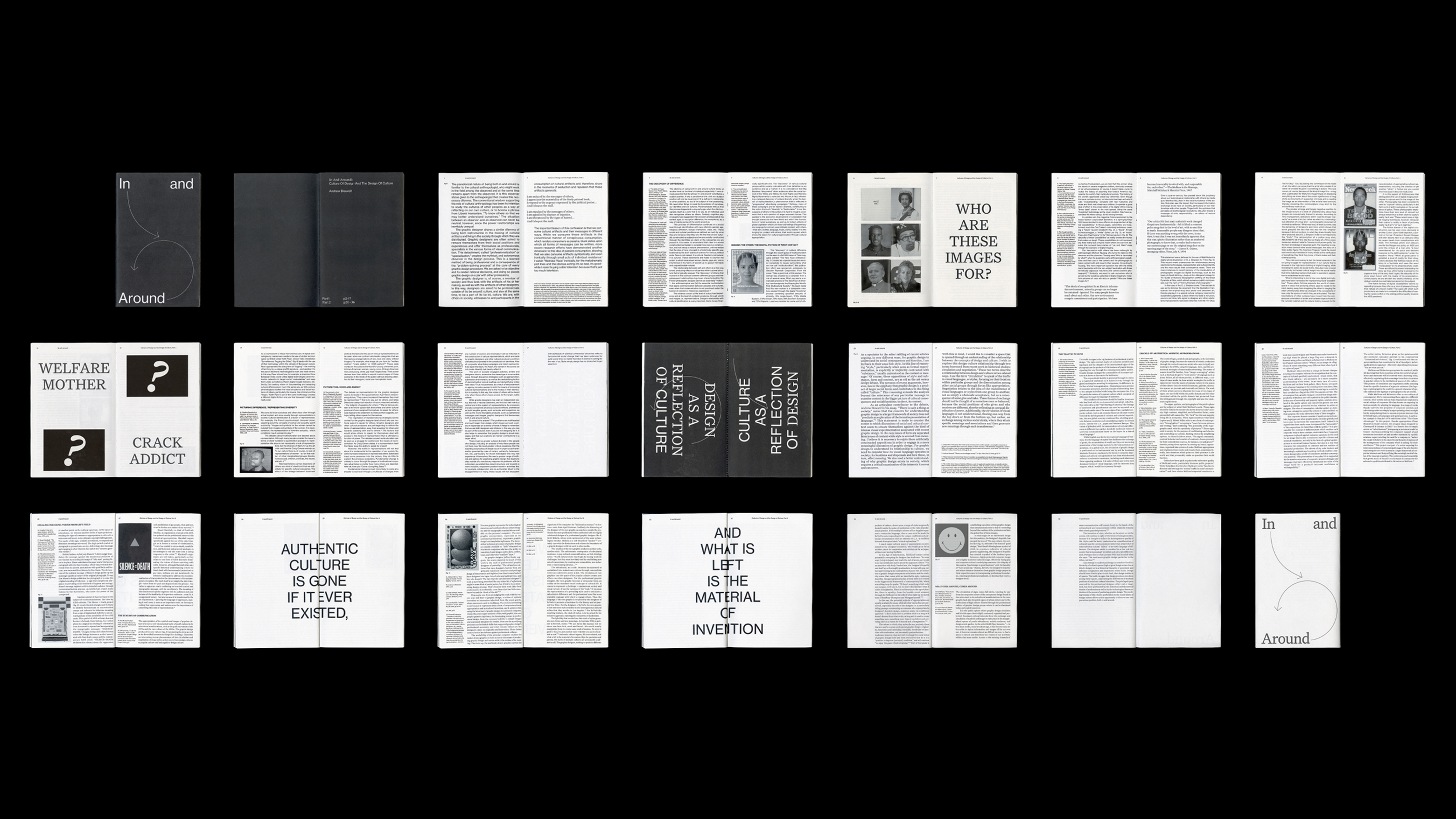
In and Around
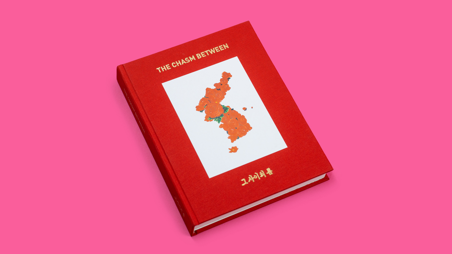
The Chasm Between